DEADLINES
A2 DEADLINES
Research and Planning/Hand in Folder: November 4th
Finished Music Video: December 16th
Finished Website/CD Cover/Evaluation/Blog:13th January
Showing posts with label CD Digipack. Show all posts
Monday, 10 January 2011
Monday, 6 December 2010
Today's Lesson - Monday 6th
As well as continuing with editing the video we carried on designing the insides of the didpack. This is the design so far for the CD and inside of the digipack. We decided to stick to the newspaper and clown theme as it has run throughout with the video and the front cover. However this time we have included pictures of the band as clowns to give across the indie feel. We also put the song titles on the CD round the edges because it looks more interesting.
We may mess around a bit more with this design.
-Rebecca
Album Cover and Back
As it snowed and college was closed, we decided to all meet up and work on the album design. This is the nearly finished album front and back design for our chosen song. It has differed from the previous designs as the front with the windows on the house is more central and we have made the text more circus like. On the back we have put the song titles on the newspaper and included all the relevant information for the band and company Domino Records which is also on the back of previous Arctic Monkeys albums.
The only changes we will make now is to make the title on the front a bit more evan so it looks neater.
- Rebecca
Wednesday, 24 November 2010
Today's lesson.
Today we just carried on editing the video, and creating the Digi-Pack below is snapshot of how we're doing so far. On an evaluating thought, our media teacher did say that the right hand side of the front cover looks a little off balance, as all the focus is at the window, so we will aim to work on that, and come up with a solution ( this area could be for where the barcode and record label info could be featured.
-Sophie
Monday, 22 November 2010
CD Designs Draft 3
Today in lesson, we got the templates for the CD digipaks so we edited or favorite photos from our shoot to fit into the front and back covers.
We chose a similar colour to Arctic Monkeys for the the band name from the album with our chosen song on it.
On the back cover we are going to edit the newspaper so that we can put all the song names on.
-Rebecca
Thursday, 18 November 2010
Evaluation of Film Shoot.
Yesterday, we filmed the footage for our first location. Looking back on the shoot, it was very stressful, but we feel accomplished almost all of the footage, that we required to shoot.. we do intend to re-shoot a few scenes, as the lighting/ composition isn't quite right. All throughout the shoot we also took still photos, and before the film shoot we did a camera shoot, to gain the images for the website/Digipack.


-All Group


-All Group
Wednesday, 10 November 2010
First Draft of CD Image
In today's lesson we had to start the CD images and covers, so this is our first draft of the image to go on the front cover. The back cover will be the same image but darker, and 'at night'.
- Sophie.
- Sophie.
Monday, 8 November 2010
Sunday, 31 October 2010
DigiPak Research
Mark Ronson & the Business Intl - Record Collection


Mark Ronson is a musician and music producer, his style of music currently falls into the pop genre, but it generally more retro dance sort of pop. He collaborates with many vocalists and experiments with lots of different types of music. This album is titled "Record Collection" so, the artwork correlates well with the theme of the album, the front cover shows Mark's face made up of lots of different Record covers, with a cream background. It's an inventive way of just having a portrait of the Artist. The text featured on the cover i.e the album title and Mark Ronson's current alias, also comes in various forms of record styles so the font is different for each album cover on the front cover. This way of showing the front cover puts a new twist on boring album covers, and gives the feel for the album to be a different track each time, which goes with the genre that he is following at the moment.
The back cover is pretty much the same, featuring the backs of different records. Normally, the track-list would be written in a list on the back of the album, but on this album it's nicely spread out as lists on separate albums, which again, matches the genre of retro pop that the artist is going for. the text is in different fonts, same as the front and looks nicely original.
On the inside, the actual CD is oddly plain to say the outside is so loud and garish. I assume the CD is plain because that's how records look, plain, black and with a track-list on the front. The font on the CD is plain, and the artist's name looks 70's chic font, bringing the attention to the artist.
The inside sleeve is in a standard book form like most albums, on the back is more of the record collection featuring most of the tracks on the album. On the inside of the sleeve, you immediately see bright colours and different fonts, which all look equally retro.. from the 70's or 80's. On most of the sides lyrics to the tracks are shown, but in the middle there's a larger collage of the body shot portrait Mark Ronson, using more record collections.
Over all the album is really colourful, and original I like the way that there's collages of the artist used in different ways, it looks seamless. And I like the way that the album title is 'Record Collection', and the whole album artwork is based on different record collections based on the figure of artist. I think we could take inspiration from this album as it looks really retro but really original and modern at the same time. And I think we could think about really linking the album title and the album artwork together, to do something different. As that's what Arctic Monkeys do, they do different things that don't really match the genre they're in, but oddly they still lead and give an example to the rest of the genre.
-Sophie.
The back cover is pretty much the same, featuring the backs of different records. Normally, the track-list would be written in a list on the back of the album, but on this album it's nicely spread out as lists on separate albums, which again, matches the genre of retro pop that the artist is going for. the text is in different fonts, same as the front and looks nicely original.
On the inside, the actual CD is oddly plain to say the outside is so loud and garish. I assume the CD is plain because that's how records look, plain, black and with a track-list on the front. The font on the CD is plain, and the artist's name looks 70's chic font, bringing the attention to the artist.
The inside sleeve is in a standard book form like most albums, on the back is more of the record collection featuring most of the tracks on the album. On the inside of the sleeve, you immediately see bright colours and different fonts, which all look equally retro.. from the 70's or 80's. On most of the sides lyrics to the tracks are shown, but in the middle there's a larger collage of the body shot portrait Mark Ronson, using more record collections.
Over all the album is really colourful, and original I like the way that there's collages of the artist used in different ways, it looks seamless. And I like the way that the album title is 'Record Collection', and the whole album artwork is based on different record collections based on the figure of artist. I think we could take inspiration from this album as it looks really retro but really original and modern at the same time. And I think we could think about really linking the album title and the album artwork together, to do something different. As that's what Arctic Monkeys do, they do different things that don't really match the genre they're in, but oddly they still lead and give an example to the rest of the genre.
-Sophie.
Digipak Cover Research - Vampire Weekend
We are unaware of the bands physical image (more of a pop genre convention) but we are aware of a chandelier and it looks as though there is a house party happening which implies that they are targeting a younger audience. The dark orangey colour scheme is another indie convention and suggests a deeper meaning within their songs. The font is very simple which, again, could reflect the “ordinary” band.
From the back of the albums we know what label Vampire Weekend are on (XL Records); we are also given the date of publishing and their latest album gives us two websites (XLRECORDS.COM & VAMPIREWEEKEND.COM). This back seems very simple; once again we are only given the song titles and the label information. The black and white colour scheme reinforces this theme of simplicity.
The inside of this album is very plain with a white background; so this suggests that the band themselves aren’t as exotic as “Lady Gaga”, they’re just a normal group of people. On the left there a lot of information given about the band and who helped out, this is also given on the Arctic Monkeys album so this may be something we add to our digipak. You can hardly read the information on their first CD as it has a bright yellow background and white writing; this bright colour arguably reflects the creative lyrics within the songs.
The images inside look as though they’ve been photocopied which was probably intenionally done to make this album seem almost different. They don’t need anything fancy because that’s not what they’re about. The lyrics are also given on different coloured backgrounds again creating this care-free attitude because the layout and fonts are really simple.
OUTER PACKAGING
This outer packaging is unique to this band; this makes their albums instantly recognisable to fans. Some words are more spaced out; this almost reflects the music videos as the spacing is very random.
Everything about this album seems simple which suggests that the band isn’t really bothered about everything looking “professional”; their focus is on the songs and their meanings.
-Katie
-Katie
Digipak Cover Research - Arctic Monkeys - Favourite Worst Nightmare
This is the album cover for The Arctic Monkeys “Favourite worst nightmare” which is where our song “This house is a circus” comes from. The colours for this cover are very generic to the indie genre as blacks and greys are used which could resemble the dark meaningful lyrics within the songs. There is an image of an estate which could relate back to the working class; most indie bands originate from working class backgrounds so this, again, is in fitting with the genre. Bright colours are used to show the rooms in the house which adds an edge to the dull image which again could reinforce the idea of their lyrics being different to other genres such as pop.
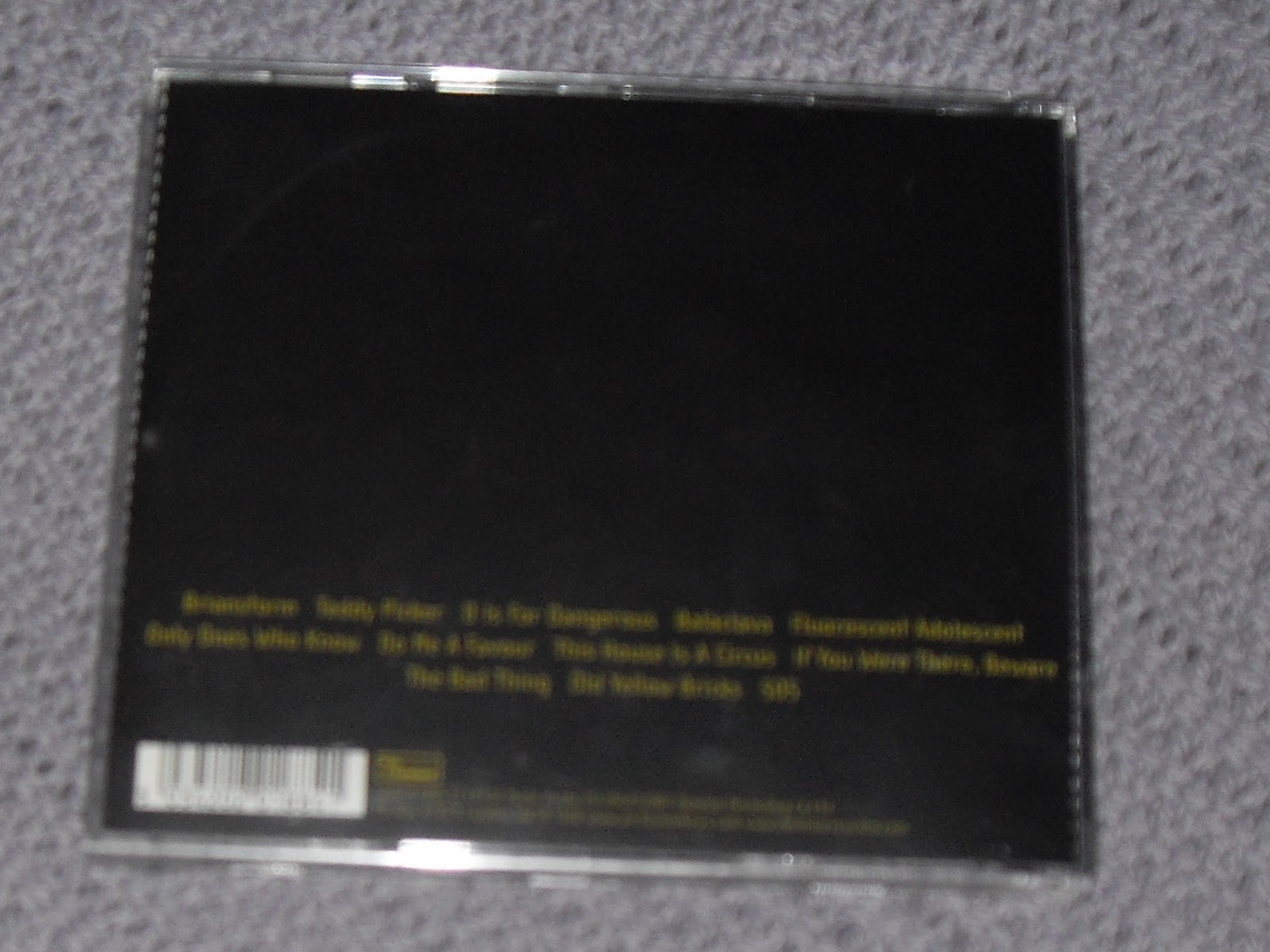
The back cover is slightly plain as the main colours used are black and yellow/ green reinforcing this idea of a dark image. No images are used; we just see the song titles which advertise the songs and not the bands image. The label is shown along with the official website for the band; this is a good way to subtly advertise the label.
The inside of the digipak reflects the outside. The image to the left shows the back of the house that’s shown on the front cover. The image on the actual CD resembles a man with fiery glasses on; this, again, reverts back to this dark indie convention that reoccurs throughout the full digipak.
You would normally expect to see the lyrics within the booklet but what we see in this is the inner goings of this “house” that’s shown on the front cover. The first page gives a thank you to the people that helped make the album (e.g. Arctic Monkeys, photography, producer etc.). The rest of the booklet shows lots of images of random objects and colours that resemble what’s happening within this “house”. From the picture above you can see that these images are quite dull and in fitting with the indie genre.
-Katie
-Katie
Wednesday, 27 October 2010
Kasabian CD analysis
After we complete our music video, we are required to create our own CD digipack for the artist we used for our video, so in our case Arctic Monkeys. Before we do this we are getting plenty of research so we know what to include in our indie genre.
Kassabians latest album - West Ryder Pauper Lunatic Asylum:
I have chosen to look at Kasabian as they are a similar genre to Arctic Monkeys but slightly more alternative. As their albums progress it is clear their sound is changing and they are essentially getting a bit weirder and this CD pack is a very good example.
Overall this digipack is appropriate to the genre of alternative/indie as it sticks to some conventions most indie/alternative digipacks include such as including the band on the front cover, the band logo being very clear, track names on the back then photos or images that relate to the tone of the album which this album certainly does. Despite this bands are not always used on the cover such as in Arctic Monkeys first two albums they do not use the band. However the third album 'Humbug' is almost similar to this cover in the ways the band members are are positioned on the cover, however on the Arctic Monkeys album they are in a normal plain setting in ordinary clothing.
-Rebecca
Research
Research and analysis into CD Digipacks-
The Kooks-


These images are from The Kooks's album Inside in/ Inside Out, released in 2006 and falls into the Indie genre, shared with the Arctic Monkeys.
The images on the front cover show a plain white background with the band playing instruments in black, showing the emphasis on the band, and the music, this fits in with the normal image for the indie genre, as the emphasis is that the band can use instruments to make music, not like boy band pop groups. Also on the front cover are reviews from indie magazines e.g Q, Mojo, NME. This shows that the band are up and coming, and recommended by experts in the music business. The font for the album is in black and red block capitals simple writing to carry on with the basic, simple feel of the album.
Images on the back cover the image carries on with the black and white, watching the band having a 'jamming' session. And the font is the same, throughout the digipack. The writing on the back shows the playlist of the album, and copyright smallprint. This image still is appropriate for the genre, the mise-en-scene is relevant, as they're playing the instruments and the image sells the band as people who care about the music, which is what fans of the indie genre look for in a band.
The actual CD is bright red, and the writing is in black and white. It looks like a simple but important album. It looks kind of retro, and simplistic. Also, the first 'o' of kooks is inventively, the hole in the CD.
The cover behind the CD is a role of negatives from pictures, of the band, of what we can assume on tour. So we see the band on stage, and messing around. This fits in the the indie genre, and makes the band seem fun and approachable, like normal lads. Also, it puts the focus onto the band and performing again. The image still conforms with the colour scheme and feel of the whole Digipak.
The inside sleeve of the Digipak, folds out and has the inside and the outside. The Inside features lots of background pictures of the band on tour, and having a nice time, which shows the band as friends as well and not just a band. The images are mostly still in black, white and red, but some are in colour as well. The writing within the images feature snapshots of the lyrics for songs on the Album. Mostly the chorus or the bridge.
On the outside of the sleeve, there's an individual image of each band member, again playing their instrument, chilling out, and then one of the whole band together. All in black and white, then the album title running throught the images in red.
The album over all really fits into the indie genre, so I think as a group we can take alot from this example. The band is represented well, you get a feel that the band are chilled out, like normal lads, so they seem more sell able. I think for our digipak we could do something similar, maybe with a more lively theme but still chilled out and appropriate for the genre.
-Sophie.
The Kooks-
These images are from The Kooks's album Inside in/ Inside Out, released in 2006 and falls into the Indie genre, shared with the Arctic Monkeys.
The images on the front cover show a plain white background with the band playing instruments in black, showing the emphasis on the band, and the music, this fits in with the normal image for the indie genre, as the emphasis is that the band can use instruments to make music, not like boy band pop groups. Also on the front cover are reviews from indie magazines e.g Q, Mojo, NME. This shows that the band are up and coming, and recommended by experts in the music business. The font for the album is in black and red block capitals simple writing to carry on with the basic, simple feel of the album.
Images on the back cover the image carries on with the black and white, watching the band having a 'jamming' session. And the font is the same, throughout the digipack. The writing on the back shows the playlist of the album, and copyright smallprint. This image still is appropriate for the genre, the mise-en-scene is relevant, as they're playing the instruments and the image sells the band as people who care about the music, which is what fans of the indie genre look for in a band.
The actual CD is bright red, and the writing is in black and white. It looks like a simple but important album. It looks kind of retro, and simplistic. Also, the first 'o' of kooks is inventively, the hole in the CD.
The cover behind the CD is a role of negatives from pictures, of the band, of what we can assume on tour. So we see the band on stage, and messing around. This fits in the the indie genre, and makes the band seem fun and approachable, like normal lads. Also, it puts the focus onto the band and performing again. The image still conforms with the colour scheme and feel of the whole Digipak.
The inside sleeve of the Digipak, folds out and has the inside and the outside. The Inside features lots of background pictures of the band on tour, and having a nice time, which shows the band as friends as well and not just a band. The images are mostly still in black, white and red, but some are in colour as well. The writing within the images feature snapshots of the lyrics for songs on the Album. Mostly the chorus or the bridge.
On the outside of the sleeve, there's an individual image of each band member, again playing their instrument, chilling out, and then one of the whole band together. All in black and white, then the album title running throught the images in red.
The album over all really fits into the indie genre, so I think as a group we can take alot from this example. The band is represented well, you get a feel that the band are chilled out, like normal lads, so they seem more sell able. I think for our digipak we could do something similar, maybe with a more lively theme but still chilled out and appropriate for the genre.
-Sophie.
Subscribe to:
Posts (Atom)